Seemingly, the new millennium had a delayed effect upon the design of big-name musicians’ album covers from the early 2000s. Artists like Beyonce, Sean Paul, Gwen Stefani and Akon utilised some form of medieval-inspired blackletter fonts on their covers, taking us all on a walk down memory lane.
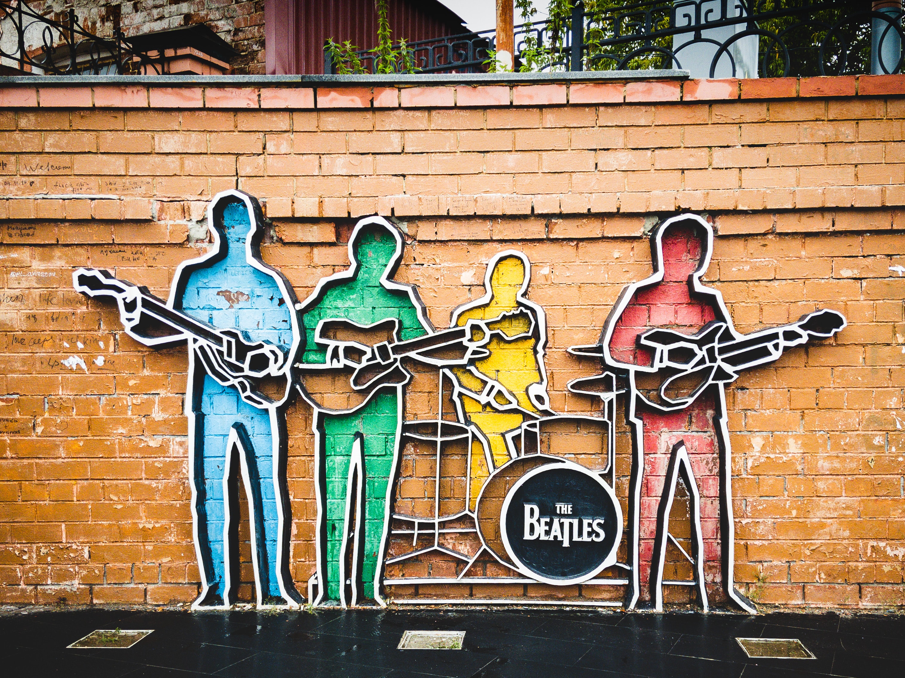
Liverpool based rock band, The Beatles are arguably one of the most influencial groups of all time, with an impressive discography and a legacy that’s been handed down for generations. Apart from the amazing tunes they’ve produced over the years, the English band took the spotlight in the media and popular culture by creating amazing artworks to accompany their music, including cover albums, tour posters, campaigns and even movies.
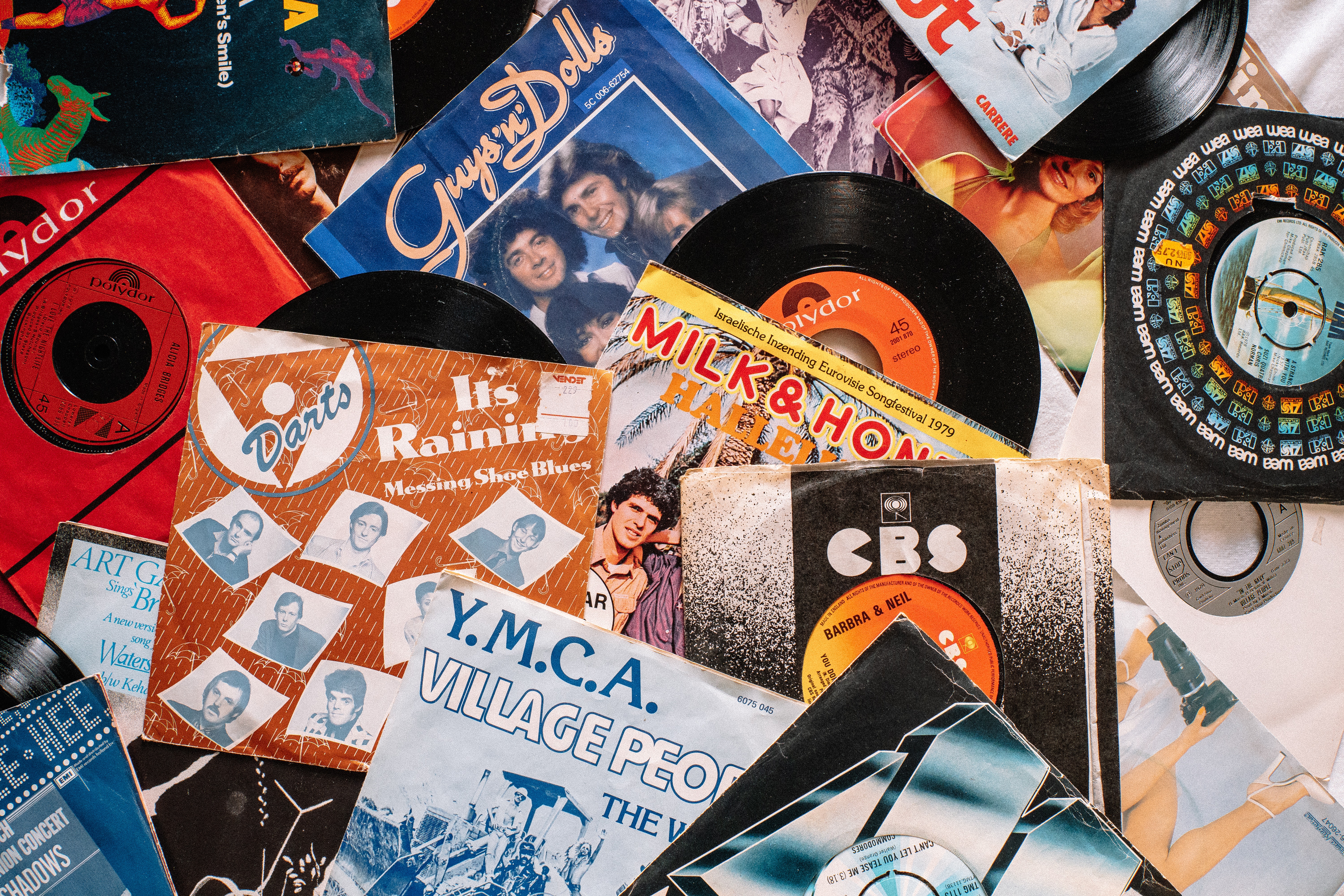
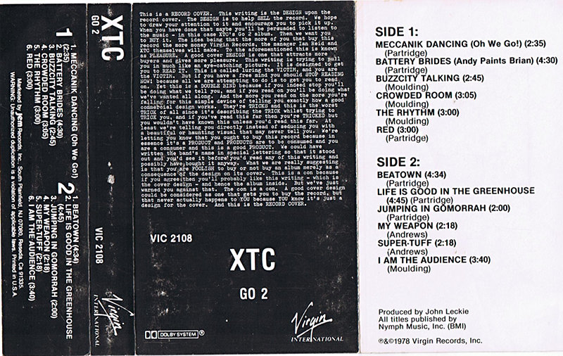
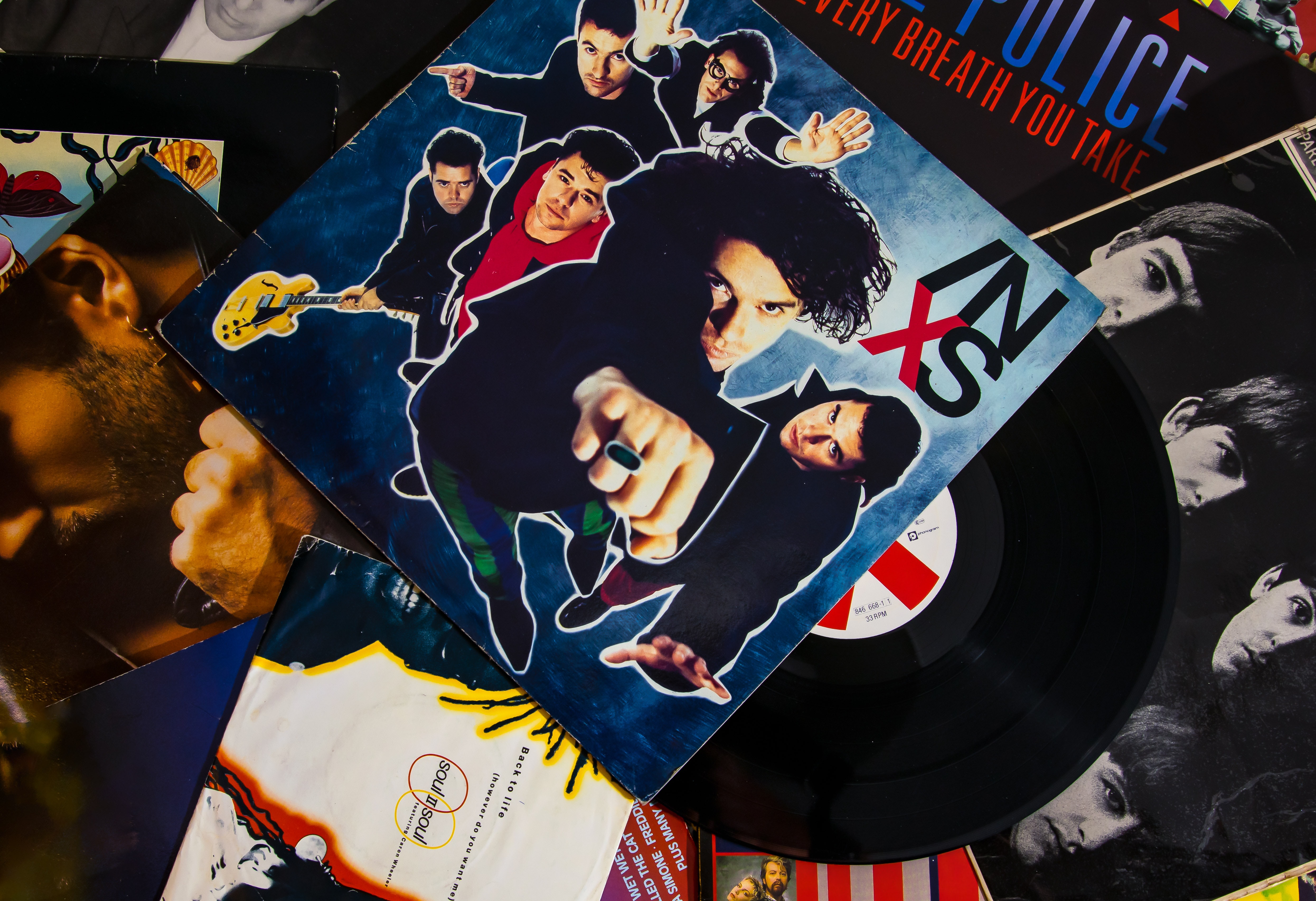
Many cover artworks from the 1950s through 1980s come down to one key element of design - typography. Seeing as photography and printing were only at the beginning of their developments, many designers would call on typography and colour coding to create engaging, unique covers for albums released at the time.
When you first pick up a record, you would expect to see at least one of these things: some sort of covert art, the name of the album and, lastly, the name of the artist. A well-designed album cover combines typography, imagery and color to create a visual representation of the music within. Usually, this is the artists’ chance to add a personal touch to their work, making it not only unique but easier to recognize by fans and new-listeners alike.
When thinking of the 90s, among the first things that come up are mullets, The Internet, and of course, the Boy Band and Girl Group craze (which would peak again during the 2010s). But, thankfully, the 90s were also when the music industry met digitalization – techno music was born, the synth was used in almost every one-hit-wonder song and album covers looked like posters of The Matrix you would see displayed at the cinema. Let’s take a trip down memory lane and look at some album covers that make use of digital typefaces and see how deep they immerse us in the cybernetic universe.
The public is often used to associating one typeface with a certain brand – take for example the famous Didot font used for the cover of Vogue magazine, or Netflix’s easily recognizable Bebas Neue, the majority of people would recognize the brand by the style of lettering they use. However, the same can go the other way around; meaning the typeface often hints at the tone and emotion of something it’s attached to. And musicians have quickly realized that, resulting in the continuous use of the Cooper Black font on the cover of music albums.